Facebook Professional
In the world of professional networking apps, it seems that everyone is jumping on the bandwagon and are adjusting their current social media platform to be part of this growing industry. With self-reporting numbers of 2.32 billion active Facebook users and with an average age group of 25-34 years old, Facebook is in a prime position to transition into the arena of professional networking apps.
Facebook Professional was a team project that concocted the idea of helping Facebook enter the professional networking social media arena by creating a functionality into their current platform, to position them in a prime position to compete with notable companies such as LinkedIn.
The Challenge
Based on user interviews it was made evident that users would be open to the idea of using Facebook professional network if and only they were guaranteed they would have the power to decide who of their Facebook friends would be transferred over to their professional domain.
My Role
Lead Project Manager
Incorporated integration of software to help our team organize, collaborate, contribute and create our deliverables, such as Trello, Milanote, Draw.io.com, Gloomaps, and Adobe XD.
Secondary Role: Research
- Researched Facebook’s statistics for currently active users, gender and age group of active users, and Facebook usage trends.
- Created Test Plan Brief
- Created Test Script
- Created Adult Consent Form
- Rainbow Spreadsheet:
- To document usability testing observations and findings and to determine prioritization of features for FB Professional App prototype.
Project Opportunities
- Deciding whether added professional functionality would be a feature within Facebook’s current app or be a separate app within the Facebook platform, like Messenger.
- How will Facebook users be able to distinguish between Facebook personal friends and Facebook Professional connections?
- Create UI design that would allow users to differentiate between Facebook Professional and Facebook personal account.
- Choosing which features we wanted to include on version one of Facebook Professional.
Competitive Analysis
We conducted competitive analysis among professional networking apps and/or services currently on the market to identify current trends and for aesthetic inspiration. These include: LinkedIn, Lunch Meet, Bumble Bizz and Branch Out:
- LinkedIn although it counts with an established pool of recruiters, it only caters to top tier professionals.
- Branch Out was an application that work out of the Facebook platform, and although it’s no longer active, it showed us the possibilities of what is possible to do within Facebook platform.
- Lunch Meet uses LinkedIn’s API so that you can schedule impromptu lunch meetings with your LinkedIn contacts, but you can only meet up if you and your contact have available time slots for a lunch meeting.
- Bumble Bizz is a professional networking and mentorship platform designed to and for women. We as a group liked the aesthetics and work flow of the App and used it as inspiration for our App.
- We created a visual board to compare the UI between competitors and to gain ideas for our own solution.
Heuristic Evaluation
We conducted a heuristic evaluation of the current Facebook App with the purpose of helping us develop a better user experience for Facebook Professional, and to identify areas of opportunities.
- Layouts for different sections like Groups, Marketplace, Friends are inconsistent and confusing
- Predominantly scroll down navigation, not many opportunities for animation or micro interaction
- Users are discoverable by anybody on the app (privacy concerns)
- Too many filter options can be overwhelming
- Page Layout & Visual/Aesthetic Design: Busy, crowded layout.
- Accessibility & Technical Design: Small fonts
- Some functionalities are hard to access (eg. view likes, comments)
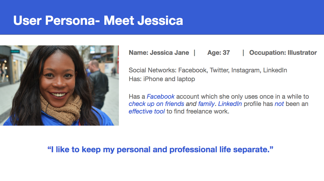
User Persona
We conceived a user persona based on Facebook’s relevant user age group of 25-34 years old.
Information Architecture
- We built the IA for the app in order to make finding important information quickly and be able to navigate easily to complete the tasks the user would need to accomplish such as, creating a profile and making a connection.
- We created a sitemap based on IA and to guide us when developing our mid-fidelity wireframing.

Journey Map
 We created a journey map to demonstrate the feelings our user persona would experience from the starting point of creating a profile to the adding of connections.
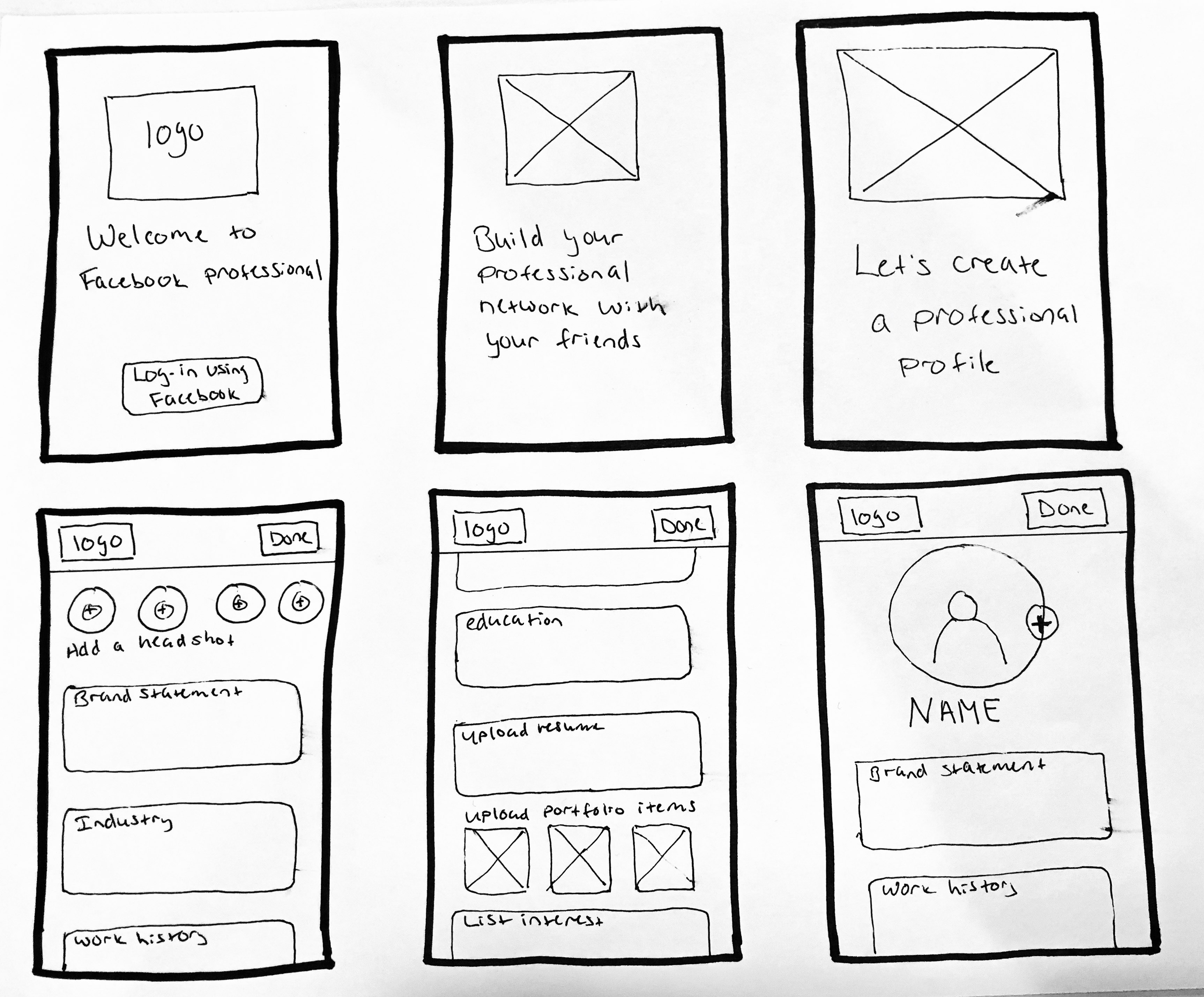
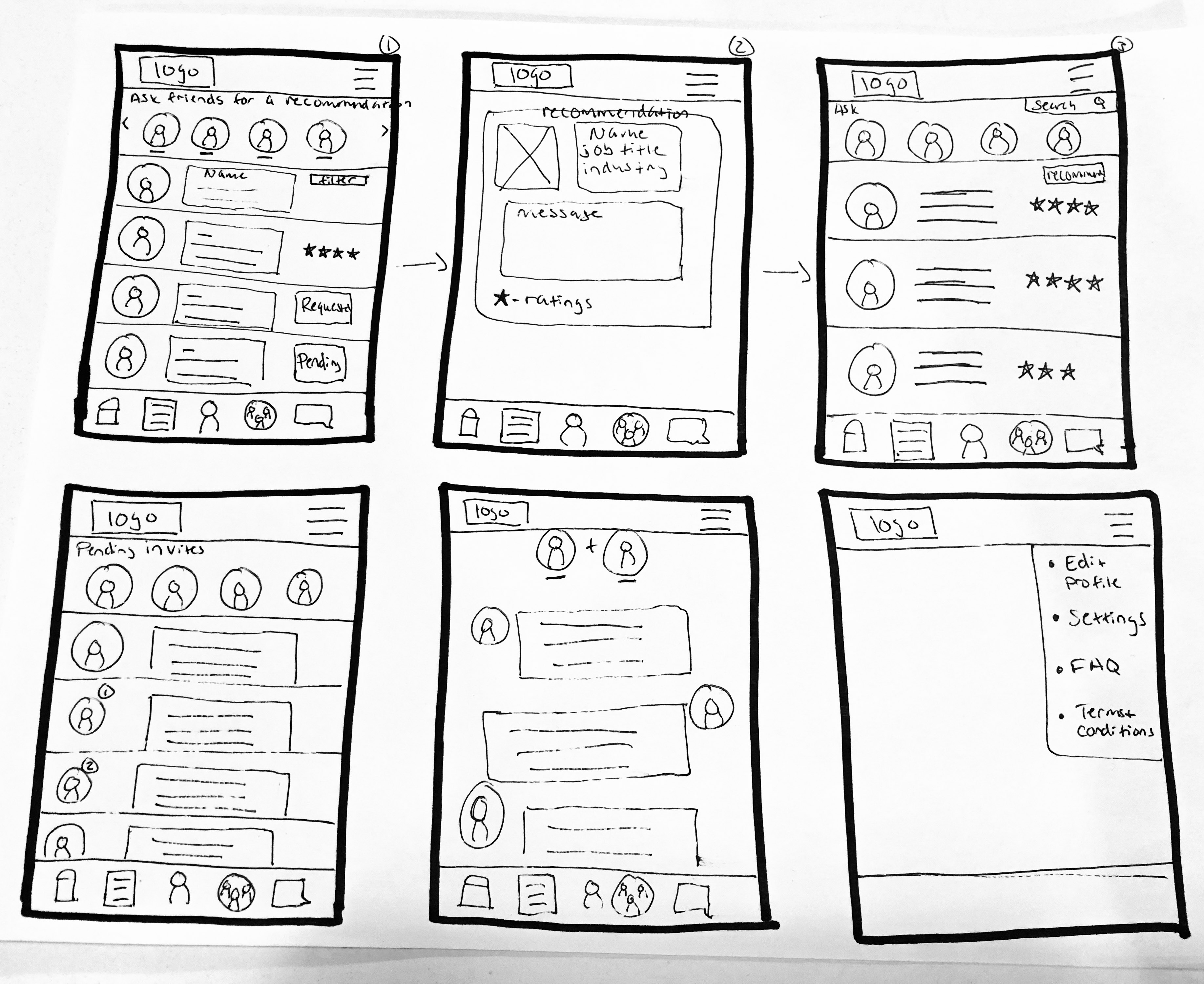
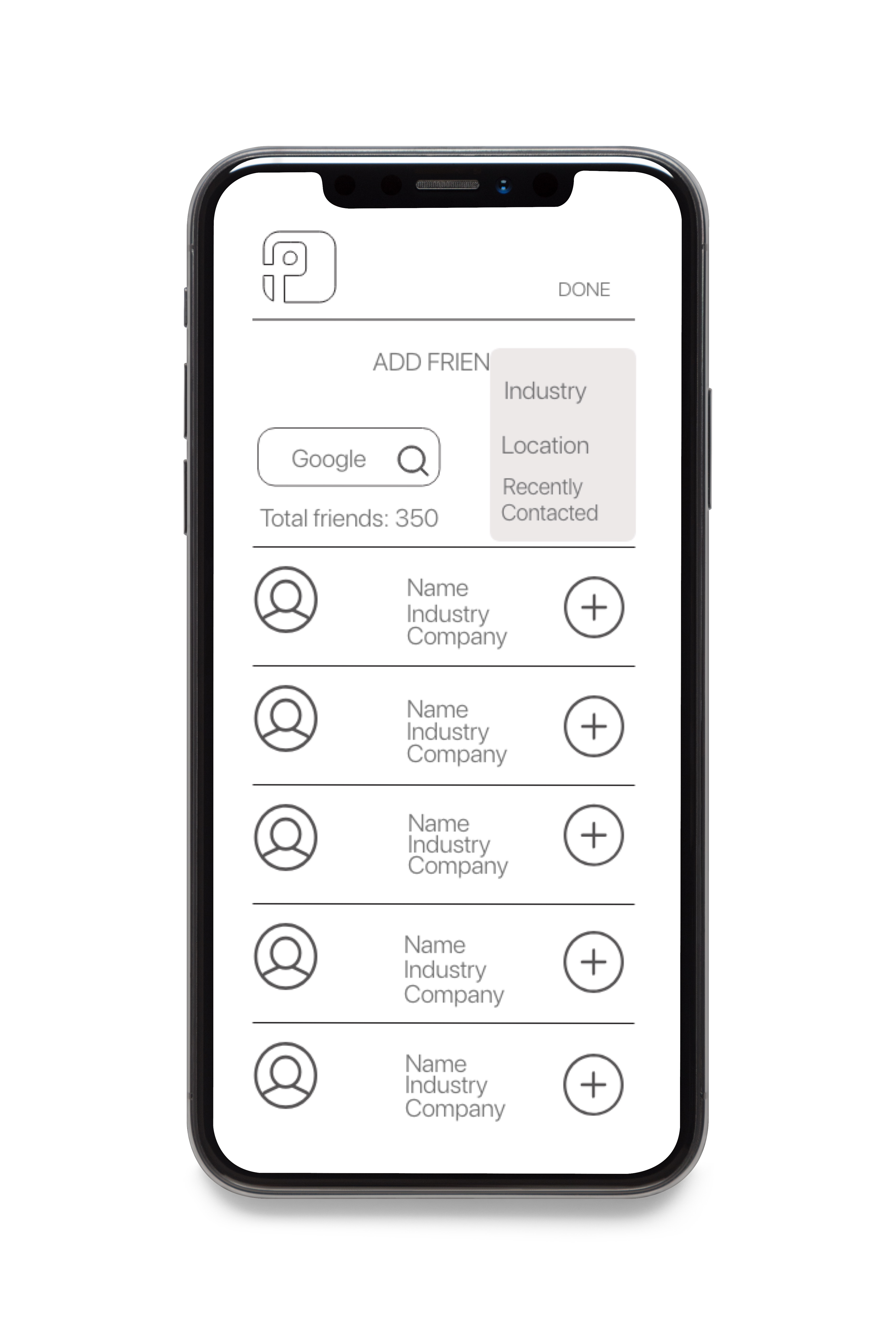
Wireframes
- Through a design studio session, we were able to prioritize features for our sub app and we produced low fidelity sketches to help with our mid-fidelity wireframes.
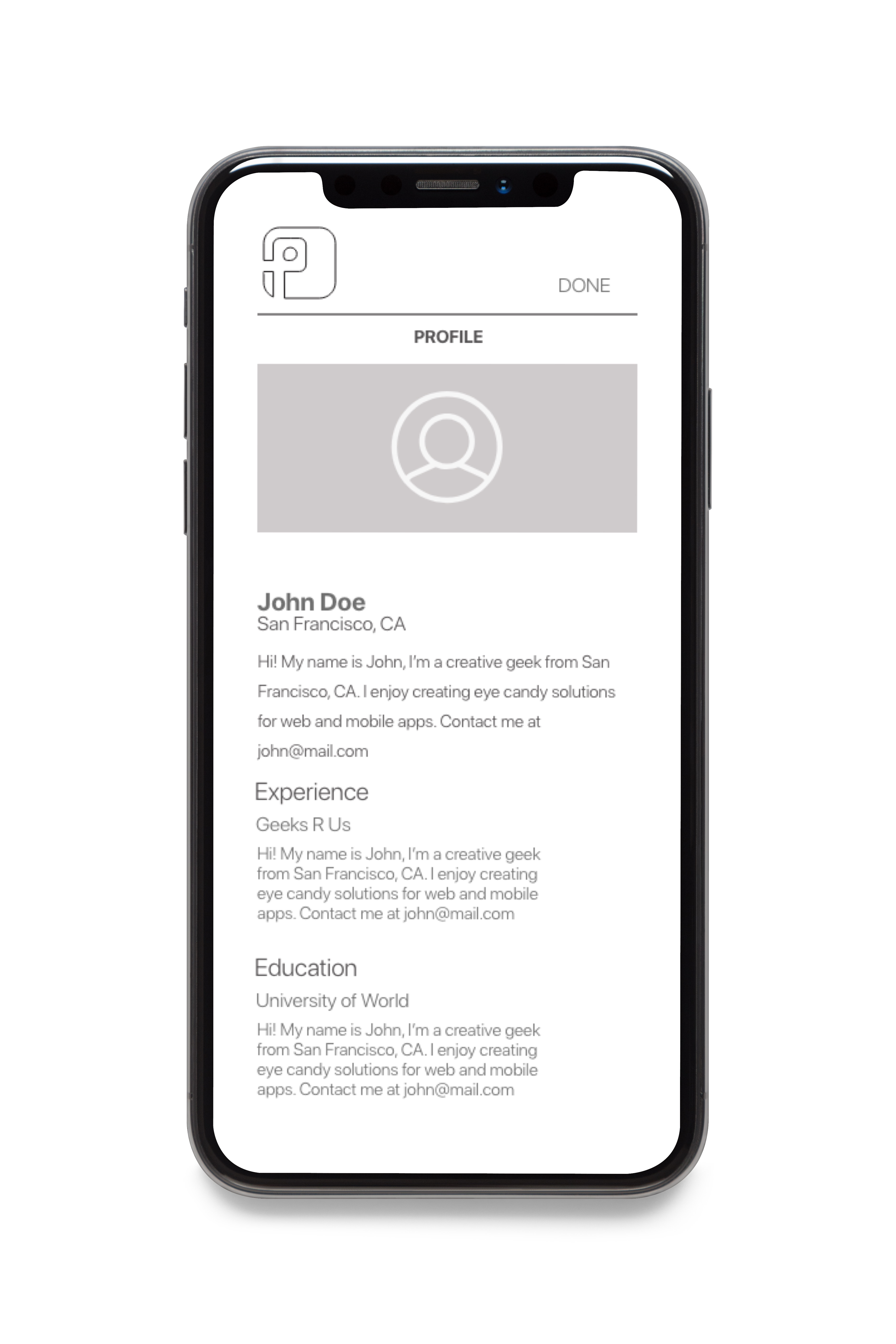
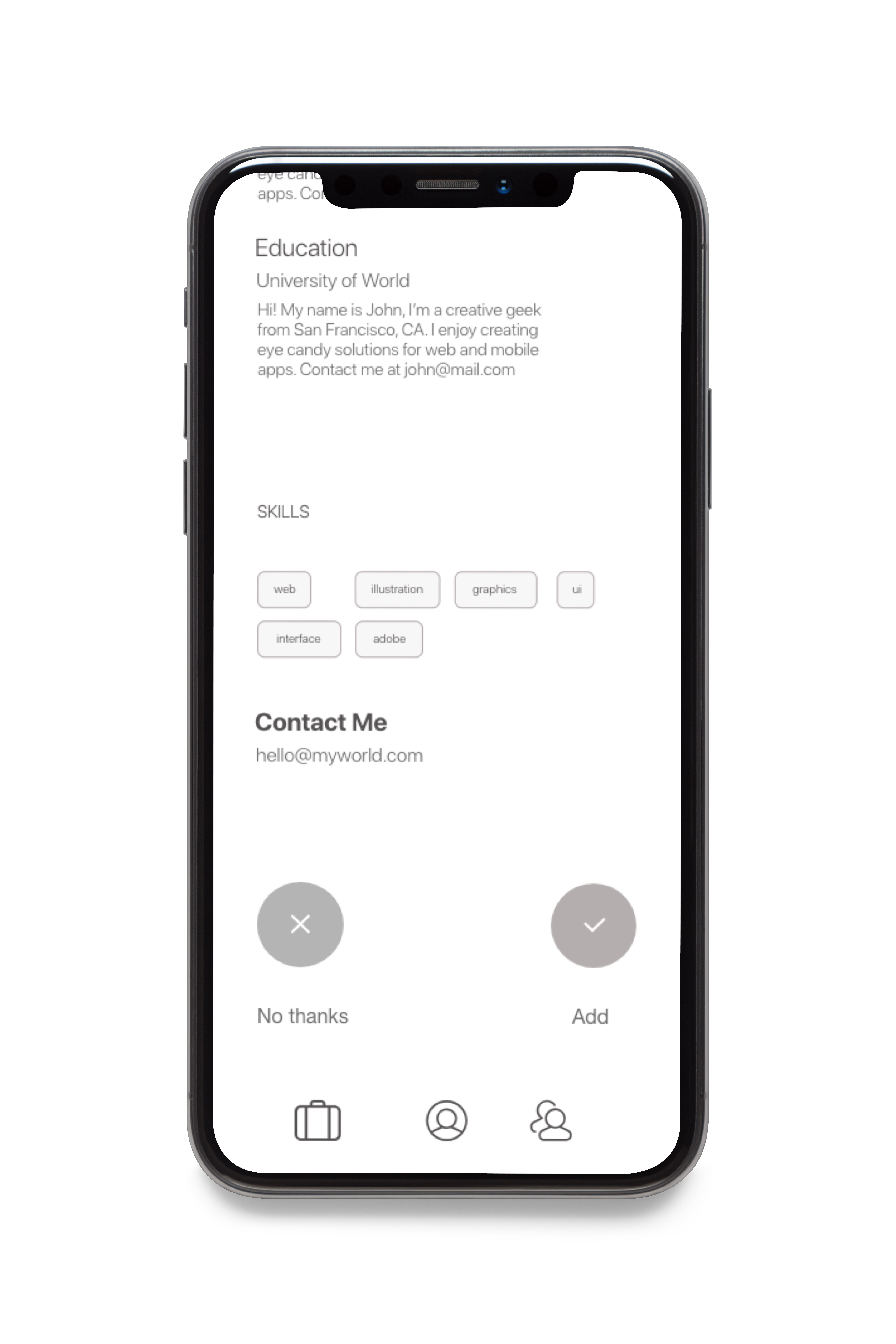
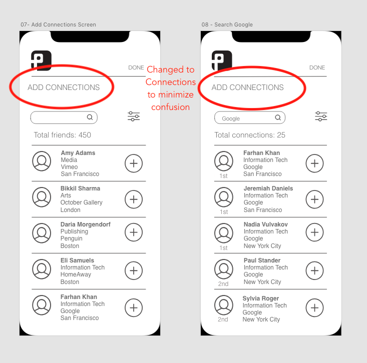
- I created 6 screens on Adobe XD for the “Adding Connections” that were later compiled with the rest of the screens assigned to other team members to create our mid-fidelity wireframes.
- Visual Design lead team mate, created a style guide for us to abide to creation of mid-fidelity wireframes that we would be converting to a prototype.

Mid-Fidelity Prototype
- Combined all mid-fidelity wireframes together.
- We all participated on the interaction design of our prototype by creating the connections for our prototype using Adobe XD.


Usability Testing
We created two tasks in order to have test participants perform to validate prototype.
1) To create a profile on Facebook Profile.
2) To add a connection based on location and company using the filter system.
- Tested 6 participants
- Conducted usability testing of app prototype and we used the rainbow spreadsheet to collect all my observations during and after the test administration and also jotted down notes.
Outcome
Based on our observations during usability testing, we made the following changes to our prototype design:
- Used consistent vocabulary throughout App:
Got rid of any “friends” references (FB) and switched to “connections” (FB professional) terminology.
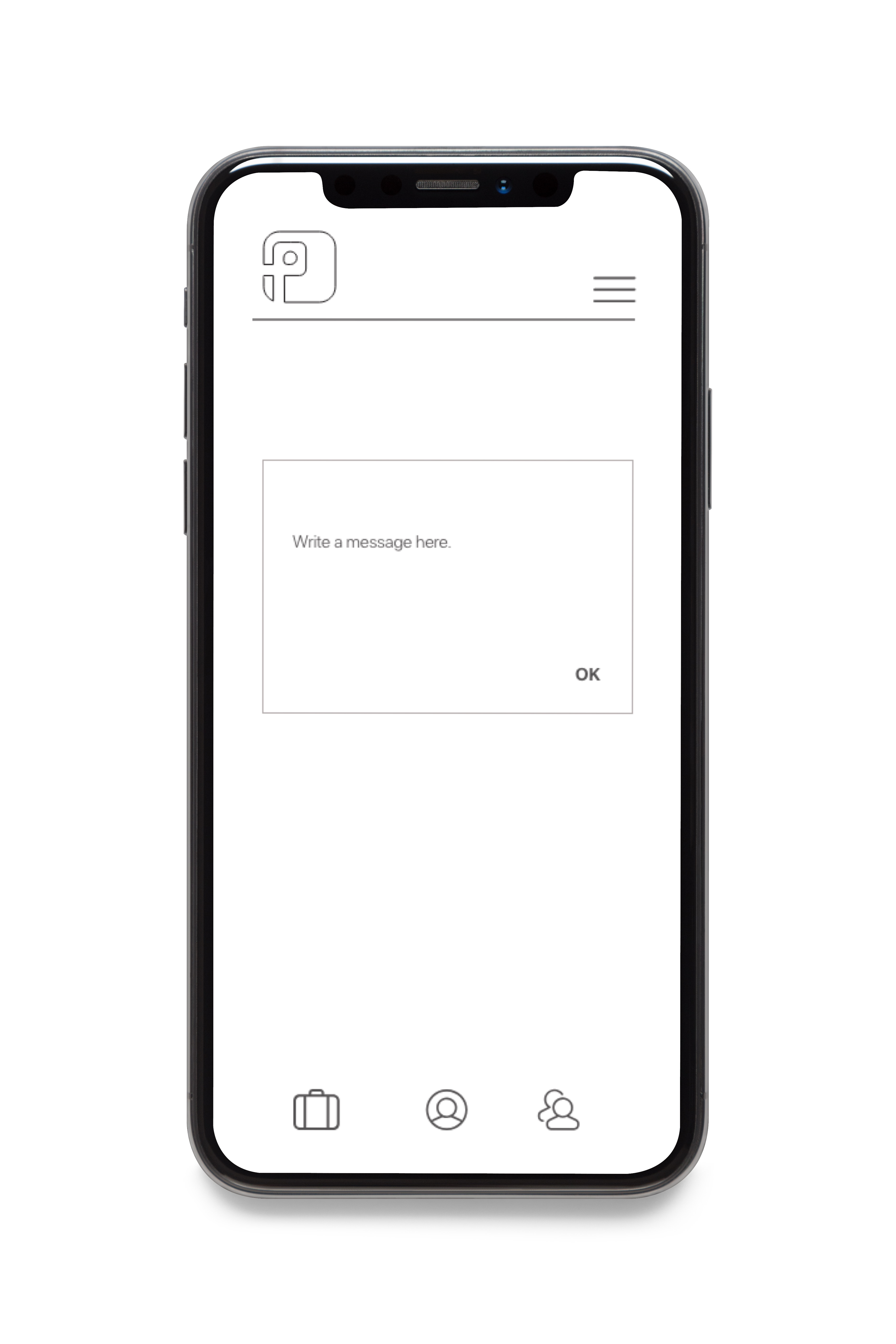
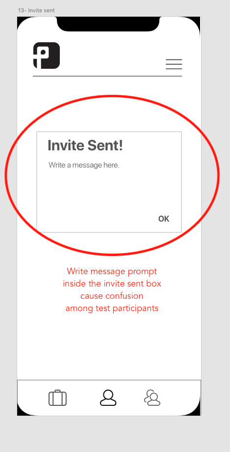
- Invite Screen was split into two screens:
Users were confused by Invite screen, because there was a prompt to add message after it was sent. One screen prompt to add message, then send. The second screen gave sent invite confirmation.


Final Prototype
Insights & Lessons Learned
I thought that the notion of incorporating a professional component into the current Facebook platform was going to be a hard sell to users, but I was surprised to see that not only were people open to the idea, they welcomed it as long as they were given the control of being able to select who to connect with.
Another interesting observation was the notable difference of opinion in regard to some of our app’s features, such as being able to demonstrate more than one image on their profile page. I felt this was due to the generational age gap. Test participants among the age group of 25-35 were not thrown off by the ability to upload more than one image for their profile images. But on the other hand, test participants among the age group of 40 or older, could not understand why you would want to showcase more than one image.